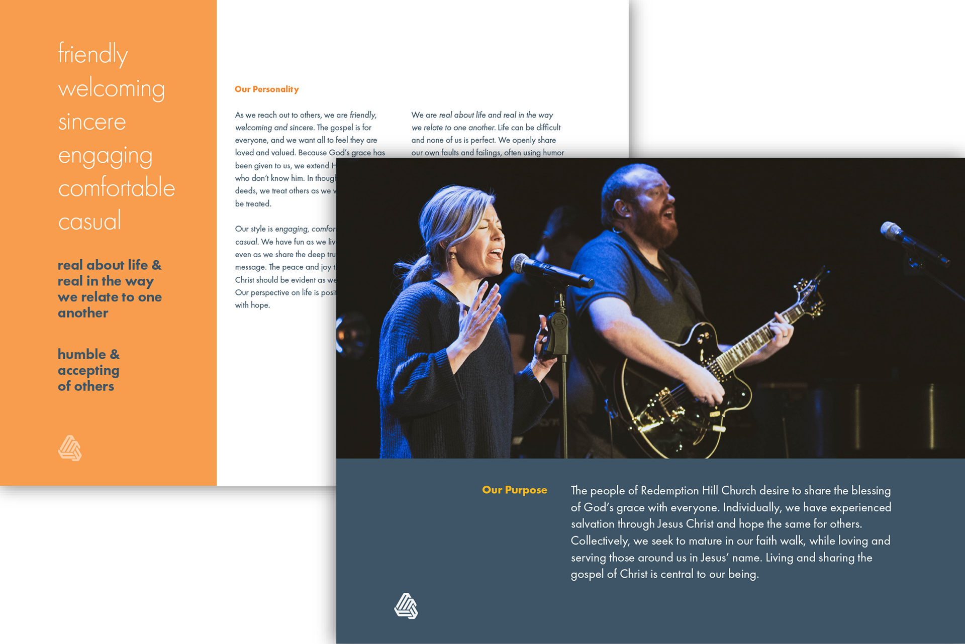
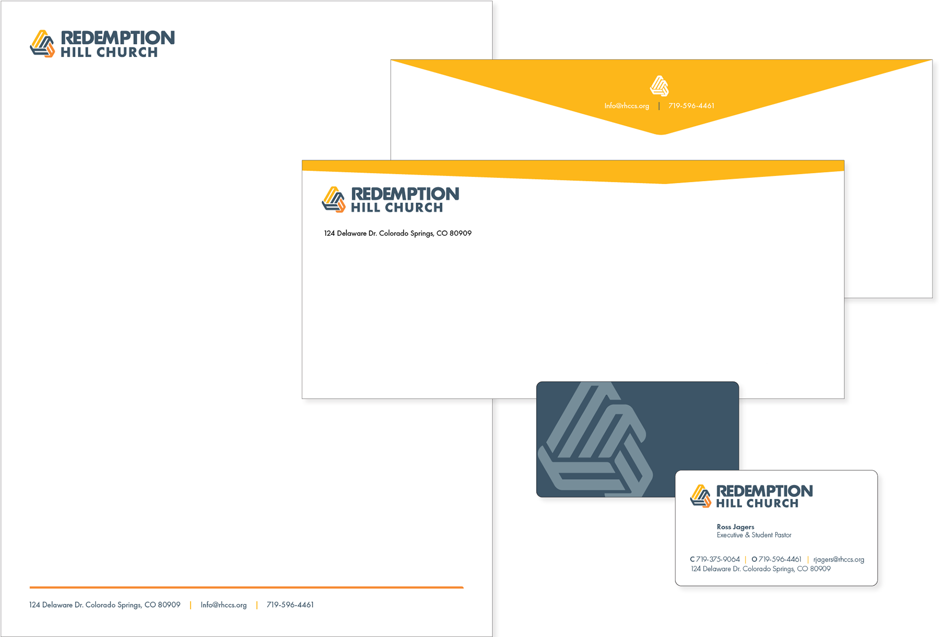
A stylized stevedore’s knot symbolizes core church principles of interconnectedness and community belonging. It illustrates how individuals are drawn to Christ, empowered to serve, and sent out to the community.

“Thank you so much for the amazing work that you put into our logo! We love it! It was our pleasure to be able to work with you. We were all very impressed with how you approached the process and really spent time getting to know us and understand the culture of our church.”
— Ross Jagers, Co-pastor
Redemption Hill Church relaunched in a new location and desired a logo to fit with the updated personality of the church. The pastoral staff and I brainstormed together to identify key elements of their church's unique personality. The resulting logo and brand identity fit exactly what they were looking for.
A stylized stevedore’s knot references core church values of interconnectedness and belonging. It illustrates how people are drawn to Christ, equipped to serve and sent out to the community.
Interwoven strands visualize how Christ holds the Church firmly together and references the cord of three strands which is not easily broken, while three colors allude to the triune nature of God.
Customized font uses selective curves, kerning and letter fusion to visually integrate logotype with brand mark. Emphasis given through size and weight to Redemption because sharing Christ’s redemption is church’s primary focus.
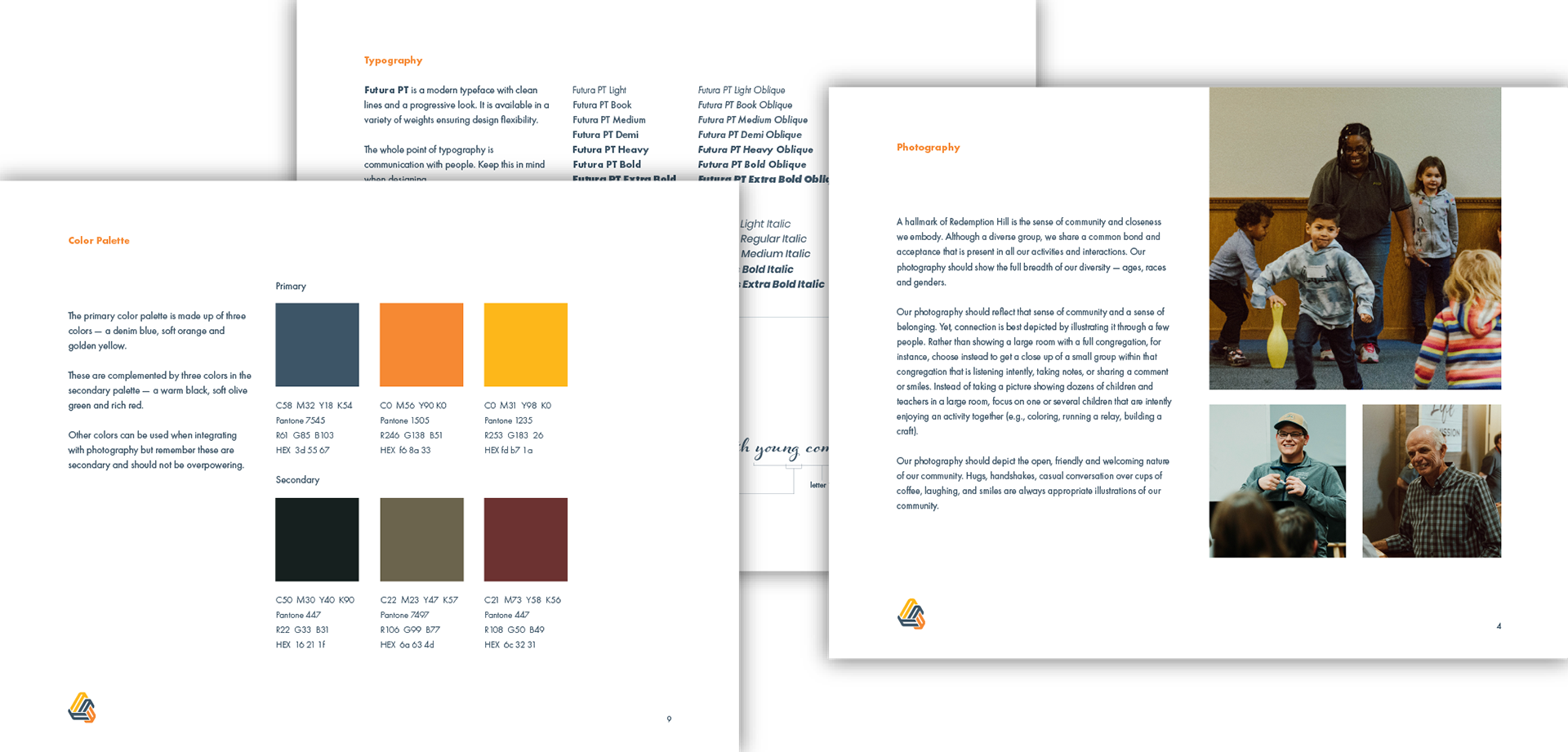
Collateral Package
Comprehensive Style Guide